Design Concerns in Creating Privacy Notices
This blog post was edited by Elonnai Hickok.
The Role of Design in Enabling Informed Consent
Currently, privacy notices and choice mechanisms, are largely ineffective. Privacy and security researchers have concluded that privacy notices not only fail to help consumers make informed privacy decisions but are mostly ignored by them. [1] They have been reduced to being a mere necessity to ensure legal compliance for companies. The design of privacy systems has an essential role in determining whether the users read the notices and understand them. While it is important to assess the data practices of a company, the communication of privacy policies to users is also a key factor in ensuring that the users are protected from privacy threats. If they do not read or understand the privacy policy, they are not protected by it at all.
The visual communication of a privacy notice is determined by the User Interface (UI) and User Experience (UX) design of that online platform. User experience design is broadly about creating the logical flow from one step to the next in any digital system, and user interface design ensures that each screen or page that the user interacts with has a consistent visual language and styling. This compliments the path created by the user experience designer. [2] UI/UX design still follows the basic principles of visual communication where information is made understandable, usable and interesting with the use of elements such as colours, typography, scale, and spacing.
In order to facilitate informed consent, the design principles are to be applied to ensure that the privacy policy is presented clearly, and in the most accessible form. A paper by Batya Friedman, Peyina Lin, and Jessica K. Miller, ‘Informed Consent By Design’, presents a model of informed consent for information systems. [3] It mentions the six components of the model; Disclosure, Comprehension, Voluntariness, Competence, Agreement, Minimal Distraction. The design of a notice should achieve these components to enable informed consent. Disclosure and comprehension lead to the user being ‘informed’ while ‘consent’ encompasses voluntariness, competence, and agreement. Finally, The tasks of being informed and giving consentshould happen with minimal distraction, without diverting users from their primary taskor overwhelming them with unnecessary noise.[4]
UI/UX design builds upon user behaviour to anticipate their interaction with the platform. It has led to practices where the UI/UX design is directed at influencing the user to respond in a way that is desired by the system. For instance, the design of default options prompts users to allow the system to collect their data when the ‘Allow’ button is checked by default. Such practices where the interface design is used to push users in a particular direction are called “dark patterns”.[5] These are tricks used in websites and apps that make users buy or sign up for things that they did not intend to. [6] Dark patterns are often followed as UI/UX trends without the consequences on users being questioned. This has had implications on the design of privacy systems as well. Privacy notices are currently being designed to be invisible instead of drawing attention towards them.
Moreover, most communication designers believe that privacy notices are beyond their scope of expertise. They do not consider themselves accountable for how a notice comes across to the user. Designers also believe that they have limited agency when it comes to designing privacy notices as most of the decisions have been already taken by the company or the service. They can play a major role in communicating privacy concerns at an interface level, but the issues of privacy are much deeper. Designers tend to find ways of informing the user without compromising the user experience, and in the process choose aesthetic decisions over informed consent.
Issues with Visual Communication of Privacy Notices
The ineffectiveness of privacy notices can be attributed to several broad issues such as the complex language and length, their timing, and location. In 2015, the Center for Plain Language [7] published a privacy-policy analysis report [8] for TIME.com [9], evaluating internet-based companies’ privacy policies to determine how well they followed plain language guidelines. The report concluded that among the most popular companies, Google and Facebook had the more accessible notices, while Apple, Uber, and Twitter were ranked as less accessible. The timing of notices is also crucial in ensuring that it is read by the users. The primary task for the user is to avail the service being offered. The goals of security and privacy are valued but are only secondary in this process. [10] Notices are presented at a time when they are seen as a barrier between the user and the service. People thus, choose to ignore the notices and move on to their primary task. Another concern is disassociated notices or notices which are presented on a separate website or manual. The added effort of going to an external website also gets in the way of the users which leads to them not reading the notice. While most of these issues can be dealt with at the strategic level of designing the notice, there are also specific visual communication design issues that are required to be addressed.
Invisible Structure and Organisation of Information
Long spells of text with no visible structure or content organisation is the lowest form of privacy notices. These are the blocks of text where the information is flattened with no visual markers such as a section separator, or contrasting colour and typography to distinguish between the types of content. In such notices, the headings and subheadings are also not easy to locate and comprehend. For a user, the large block of text appears to be pointless and irrelevant, and they begin to dismiss or ignore it. Further, the amount of time it would take for the user to read the entire text and comprehend it successfully, is simply impractical, considering the number of websites they visit regularly.
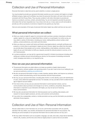
The privacy policy notice by Apple [11] with no use of colours or visuals.
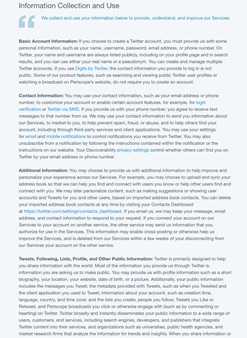
The privacy policy notice by Twitter [12] no visual segregator
Visual Contrast Between Front Interface and Privacy Notices
The front facing interface of an app or website is designed to be far more engaging than the privacy notice pages. There is a visible difference in the UI/UX design of the pages, almost as if the privacy notices were not designed at all. In case of Uber’s mobile app, the process of adding a destination, selecting the type of cab and confirming a ride has been made simple to do for any user. This interface has been thought through keeping in mind the users’ behaviour and needs. It allows for quick and efficient use of the service. As opposed to the process of buying into the service, the privacy notice on the app is complex and unclear.


Uber mobile app screenshots of the front interface (left) and the policy notice page (right)
Gaining Trust Through the Initial Pitch
A pattern in the privacy notices of most companies is that they attempt to establish credibility and gain confidence by stating that they respect the users’ privacy. This can be seen in the introductory text of the privacy notices of Apple and LinkedIn. The underlying intent seems to be that since the company understands that the users’ privacy is important, the users can rely on them and not read the full notice.
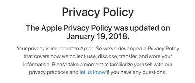
Introduction text to Apple’s privacy policy notice [13]
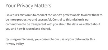
Introduction text to LinkedIn’s privacy policy notice [14]
Low Navigability
The text heavy notices need clear content pockets which can be navigated through easily using mechanisms such as menu bar. Navigability of a document allows for quick locating of sections, and moving between them. Several companies miss to follow this. Apple and Twitter privacy notices (shown above), have low navigability as the reader has no prior indication of how many sections there are in the notice. The reader could have summarised the content based on the titles of the sections if it were available in a table of contents or a menu. Lack of a navigation system leads to endless scrolling to reach the end of the page.
Facebook privacy notice, on the other hand is an example of good navigability. It uses typography and colour to build a clear structure of information that can be navigated through easily using the side menu. The menu doubles up as a table of contents for the reader. The side menu however, does not remain visible while scrolling down the page. This means while the user is reading through a section, they cannot switch to a different section from the menu directly. They will need to click on the ‘Return to top’ button and then select the section from the menu.
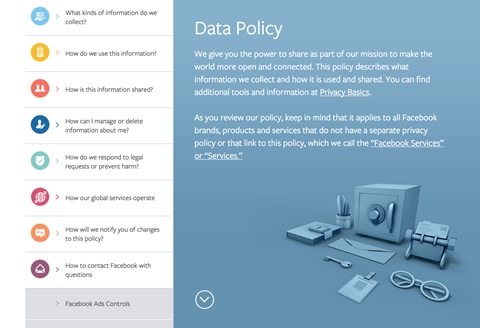
Navigation menu in the Facebook Data Policy page [15]
Lack of Visual Support
Privacy notices can rely heavily on visuals to convey the policies more efficiently. These could be visual summaries or supporting infographics. The data flow on the platform and how it would affect the users can be clearly visualised using infographics. But, most notices fail to adopt them. The Linkedin privacy notice [16] page shows a video at the beginning of its privacy policy. Although this could have been an opportunity to explain the policy in the video, LinkedIn only gives an introduction to the notice and follows it with a pitch to use the platform. The only visual used in notices currently are icons. Facebook uses icons to identify the different sections so that they can be located easily. But, apart from being identifiers of sections, these icons do not contribute to the communication of the policy. It does not make reading of the full policy any easier.
Icon Heavy ‘Visual’ Privacy Notices
The complexity of privacy notices has led to the advent of online tools and generators that create short notices or summaries for apps and websites to supplement the full text versions of policies. Most of these short notices use icons as a way of visually depicting the categories of data that is being collected and shared. iubenda [17], an online tool, generates policy notice summary and full text based on the inputs given by the client. It asks for the services offered by the site or app, and the type of data collection. Icons are used alongside the text headings to make the summary seem more ‘visual’ and hence more easily consumable. It makes the summary more inviting to read, but does not reduce the time for reading.
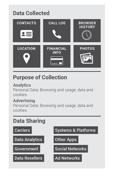
Another icon-based policy summary generator was created by KnowPrivacy. [18] They developed a policy coding methodology by creating icon sets for types of data collected, general data practices, and data sharing. The use of icons in these short notices is more meaningful as they show which type of data is collected or not collected, shared or not shared at a glance without any text. This facilitates comparison between data practices of different apps.
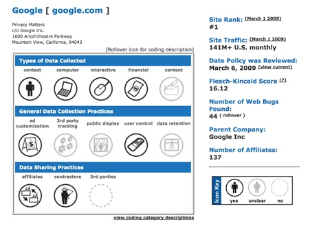
Icon based short policy notice created for Google by KnowPrivacy [19]
Initiatives to Counter Issues with the Design of Privacy Notices
Several initiatives have called out the issues with privacy notices and some have even countered them with tools and resources. The TIME.com ranking of internet-based companies’ privacy policies brought attention to the fact that some of the most popular platforms have ineffective policy notices. A user rights initiative called Terms of Services; Didn’t Read [20] rates and labels websites’ terms & privacy policies. There is also the Usable Privacy Policy Project which develops techniques to semi-automatically analyze privacy policies with crowdsourcing, natural language processing, and machine learning. [21] It uses artificial intelligence to sift through the most popular sites on the Internet, including Facebook, Reddit, and Twitter, and annotate their privacy policies. They realise that it is not practical for people to read privacy policies. Thus, their aim is to use technology to extract statements from the notices and match them with things that people care about. However, even AI has not been fully successful in making sense of the dense documents and missed out some important context. [22]
One of the more provocative initiatives is the Me and My Shadow ‘Lost in Small Print’ [23] project. It shows the text for the privacy notices of companies like LinkedIn, Facebook, WhatsApp, etc. and then ‘reveals’ the data collection and use information that would closely affect the users.
Issues with notices have also been addressed by standardising their format, so people can interpret the information faster. The Platform for Privacy Preferences Project (P3P) [24] was one of the initial efforts in enabling websites to share their privacy practices in a standard format. Similar to KnowPrivacy’s policy coding, there are more design initiatives that are focusing on short privacy notice design. An organisation offering services in Privacy Compliance and Risk Management Solutions called TrustArc, [25] is also in the process of designing an interactive icon-based privacy short notice.
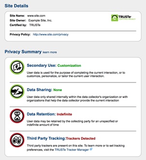
TrustArc’s proposed design [26] for the short notice for a sample site
Most efforts have been done in simplifying the notices so as to decode the complex terminology. But, there have been very few evaluations and initiatives to improve the design of these notices.
Recommendations
Multilayered Privacy Notices
One of the existing suggestions on increasing usability of privacy notices are multilayered privacy notices. [27] Multilayered privacy notices comprise a very short notice designed for use on portable digital devices where there is limited space, condensed notice that contains all the key factors in an easy to understand way, and a complete notice with all the legal requirements. [28] Some of the examples above use this in the form of short notices and summaries. The very short notice layer consists of who is collecting the information, primary uses of information, and contact details of the organisation.[29] Condensed notice layer covers scope or who does the notice apply to, personal information collected, uses and sharing, choices, specific legal requirements if any, and contact information. [30] In order to maintain consistency, the sequence of topics in the condensed and the full notice must be same. Words and phrases should also be consistent in both layers. Although an effective way of simplifying information, multi-layered notices must be reconsidered along with the timing of notices. For instance, it could be more suitable to show very short notices at the time of collection or sharing of user data.
Supporting Infographics
Based on their visual design, the currently available privacy notices can be broadly classified into 4 categories; (i) the text only notices which do not have a clearly visible structure, (ii) the text notices with a contents menu that helps in informing of the structure and in navigating, (iii) the notices with basic use of visual elements such as icons used only to identify sections or headings, (iv) multilayered notices or notices with short summary before giving out the full text. There is still a lack of visual aid in all these formats. The use of visuals in the form of infographics to depict data flows could be more helpful for the users both in short summaries and complete text of policy notices.
Integrating the Privacy Notices with the Rest of the System
The design of privacy notices usually seems disconnected to the rest of the app or website. The UI/UX design of privacy notices requires as much attention as the consumer-facing interface of a system. The contribution of the designer has to be more than creating a clean layout for the text of the notice. The integration of privacy notices with the rest of the system is also related to the early involvement of the designer in the project. The designer needs to understand the information flows and data practices of a system in order to determine whether privacy notices are needed, who should be notified, and about what. This means that decisions such as selecting the categories to be represented in the short or condensed notice, the datasets within these categories, and the ways of representing them would all be part of the design process. The design interventions cannot be purely visual or UI/UX based. They need to be worked out keeping in mind the information architecture, content design, and research. By integrating the notices, strategic decisions on the timing and layering of content can be made as well, apart from the aesthetic decisions. Just as the aim of the front face of the interface in a system makes it easier for the user to avail the service, the policy notice should also help the user in understanding the consequences, by giving them clear notice of the unexpected collection or uses of their data.
Practice Based Frameworks on Designing Privacy Notices
There is little guidance available to communication designers for the actual design of privacy notices which is specific to the requirements and characteristics of a system. [31] The UI/UX practice needs to be expanded to include ethical ways of designing privacy notices online. The paper published by Florian Schaub, Rebecca Balebako, Adam L. Durity, and Lorrie Faith Cranor, called, ‘A Design Space for Effective Privacy Notice’ in 2015 offers a comprehensive design framework and standardised vocabulary for describing privacy notice options. [32] The objective of the paper is to allow designers to use this framework and vocabulary in creating effective privacy notices. The design space suggested has four key dimensions, ‘timing’, ‘channel’, ‘modality’ and ‘control’. [33] It also provides options for each of these dimensions. For example, ‘timing’ options are ‘at setup’, ‘just in time’, ‘context-dependent’, ‘periodic’, ‘persistent’, and ‘on demand’. The dimensions and options in the design space can be expanded to accommodate new systems and interaction methods.
Considering the Diversity of Audiences
For the various mobile apps and services, there are multiple user groups who use them. The privacy notices are hence not targeted to one kind of an audience. There are diverse audiences who have different privacy preferences for the same system. [34] The privacy preferences of these diverse groups of users’ must be accommodated. In a typical design process for any system, multiple user personas are identified. The needs and behaviour of each persona is used to determine the design of the interface. Privacy preferences must also be observed as part of these considerations for personas, especially while designing the privacy notices. Different users may need different kinds of notices based on which data practices affect them.[35] Thus, rather than mandating a single mechanism for obtaining informed consent for all users in all situations, designers need to provide users with a range of mechanisms and levels of control. [36]
Ethical Framework for Design Practitioners
An ethical framework is required for design practitioners that can be followed at the level of both deciding the information flow and the experience design. With the prevalence of ‘dark patterns’, the visual design of notices is used to trick users into accepting it. Design ethics can play a huge role in countering such practices. Will Dayable, co-director at Squareweave, [37] a developer of web and mobile apps, suggests that UI/UX designers should “Design Like They’re (Users are) Drunk”. [38] He asks designers to imagine the user to be in a hurry and still allow them access to all the information necessary for making a decision. He concludes that good privacy UX and UI is about actually trying to communicate with users rather than trying to slip one past them. In principle, an ethical design practice would respect the rights of the users and proactively design to facilitate informed consent.
Reconceptualising Privacy Notices
Based on the above recommendations, a guiding sample for multilayered privacy notices has been created. Each system would need its own structure and mechanisms for notices, which are integrated with its data practice, audiences, and medium, but this sample notice provides basic guidelines for creating effective and accessible privacy notices. The aesthetic decisions would also vary based on the interface design of a system.

Sample Fixed Icon for Privacy Notifications
A fixed icon can appear along with all privacy notifications on the system, so that the users can immediately know that the notification is about a privacy concern. This icon should capture attention instantly and suggest a sense of caution. Besides its use as a call to attention, the icon can also lead to a side panel for privacy implications from all actions that the user takes.
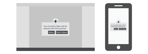
Sample Very Short Notice on Desktop and Mobile Platforms
The very short notices can be shown when an action from the user would lead to data collection or sharing. The notice mechanism should be designed to provide notices at different times tailored to a user’s needs in that context. The styling and placement of the ‘Allow’ and ‘Don’t Allow’ buttons should not be biased towards the ‘Allow’ option. The text used in very short and condensed notice layers should be engaging yet honest in its communication.
Sample Summary Notice
The summary or the condensed notice layer should allow the user to gauge at a glance, how the data policy is going to affect them. This can be combined with a menu that lists the topics covered in the full notice. The menu would double up as a navigation mechanism for users. It should be visible to users even as they scroll down to the full notice. The condensed notice can also be supported by an infographic depicting the flow of data in the system.

Sample Navigation Menu
All the images in this section use sample text for the purpose of illustrating the structure and layout
The full notice can be made accessible by creating a clear information hierarchy in the text. The menu which is available on the side while scrolling down the text would facilitate navigation and familiarity with the structure of the notice.
Conclusion
The presentation of privacy notices directly influences the decisions of users online and ineffective notices make users vulnerable to their data being misused. But currently, there is little conversation about privacy and data protection among designers. Design practice has to become sensitive to privacy and security requirements. Designers need to take the accountability of creating accessible notices which are beneficial to the users, rather than to the companies issuing them. They must prioritise the well-being of users over aesthetics and user experience even. The aesthetics of a platform must be directed at achieving transparency in the privacy notice by making it easily readable.
The design community in India has a more urgent task at hand of building a design practice that is informed by privacy. Comparing the privacy notices of Indian and global companies, Indian companies have an even longer way to go in terms of communicating the notices effectively. Most Indian companies such as Swiggy, [39] 99acres, [40] and Paytm [41] have completely textual privacy policy notices with no clear information hierarchy or navigation. Ola Cabs [42] provides an external link to their privacy notice, which opens as a pdf, making it even more inaccessible. Thus, there is a complete lack of design input in the layout of these notices.
Designers must engage in conversations with technologists and researchers, and include privacy and other user rights in design education in order to prepare practitioners for creating more valuable digital platforms.
- https://www.ftc.gov/system/files/documents/public_comments/2015/10/00038-97832.pdf
- https://www.fastcodesign.com/3032719/ui-ux-who-does-what-a-designers-guide-to-the-tech-industry
- https://vsdesign.org/publications/pdf/Security_and_Usability_ch24.pdf
- https://vsdesign.org/publications/pdf/Security_and_Usability_ch24.pdf
- https://fieldguide.gizmodo.com/dark-patterns-how-websites-are-tricking-you-into-givin-1794734134
- https://darkpatterns.org/
- https://centerforplainlanguage.org/
- https://centerforplainlanguage.org/wp-content/uploads/2016/11/TIME-privacy-policy-analysis-report.pdf
- http://time.com/3986016/google-facebook-twitter-privacy-policies/
- https://www.safaribooksonline.com/library/view/security-and-usability/0596008279/ch04.html
- https://www.apple.com/legal/privacy/en-ww/?cid=wwa-us-kwg-features-com
- https://twitter.com/privacy?lang=en
- https://www.apple.com/legal/privacy/en-ww/?cid=wwa-us-kwg-features-com
- https://www.linkedin.com/legal/privacy-policy
- https://www.facebook.com/privacy/explanation
- https://www.linkedin.com/legal/privacy-policy
- http://www.iubenda.com/blog/2013/06/13/privacypolicyforandroidapp/
- http://knowprivacy.org/policies_methodology.html
- http://knowprivacy.org/profiles/google
- https://tosdr.org/
- https://explore.usableprivacy.org/
- https://motherboard.vice.com/en_us/article/a3yz4p/browser-plugin-to-read-privacy-policy-carnegie-mellon
- https://myshadow.org/lost-in-small-print
- https://www.w3.org/P3P/
- http://www.trustarc.com/blog/2011/02/17/privacy-short-notice-designpart-i-background/
- http://www.trustarc.com/blog/?p=1253
- https://www.ftc.gov/system/files/documents/public_comments/2015/10/00038-97832.pdf
- https://www.informationpolicycentre.com/uploads/5/7/1/0/57104281/ten_steps_to_develop_a_multilayered_privacy_notice__white_paper_march_2007_.pdf
- https://www.informationpolicycentre.com/uploads/5/7/1/0/57104281/ten_steps_to_develop_a_multilayered_privacy_notice__white_paper_march_2007_.pdf
- https://www.informationpolicycentre.com/uploads/5/7/1/0/57104281/ten_steps_to_develop_a_multilayered_privacy_notice__white_paper_march_2007_.pdf
- https://www.ftc.gov/system/files/documents/public_comments/2015/10/00038-97832.pdf
- https://www.ftc.gov/system/files/documents/public_comments/2015/10/00038-97832.pdf
- https://www.ftc.gov/system/files/documents/public_comments/2015/10/00038-97832.pdf
- https://www.safaribooksonline.com/library/view/security-and-usability/0596008279/ch04.html
- https://www.ftc.gov/system/files/documents/public_comments/2015/10/00038-97832.pdf
- https://vsdesign.org/publications/pdf/Security_and_Usability_ch24.pdf
- https://www.squareweave.com.au/
- https://iapp.org/news/a/how-ui-and-ux-can-ko-privacy/
- https://www.swiggy.com/privacy-policy
- https://www.99acres.com/load/Company/privacy
- https://pages.paytm.com/privacy.html
- https://s3-ap-southeast-1.amazonaws.com/ola-prod-website/privacy_policy.pdf


